
Work with the curve
We plan around the cap shape so logos and wording still read clearly when worn.
Use contrast well
Cap colour and artwork colour need enough difference to stay recognisable.
Test front or side placement
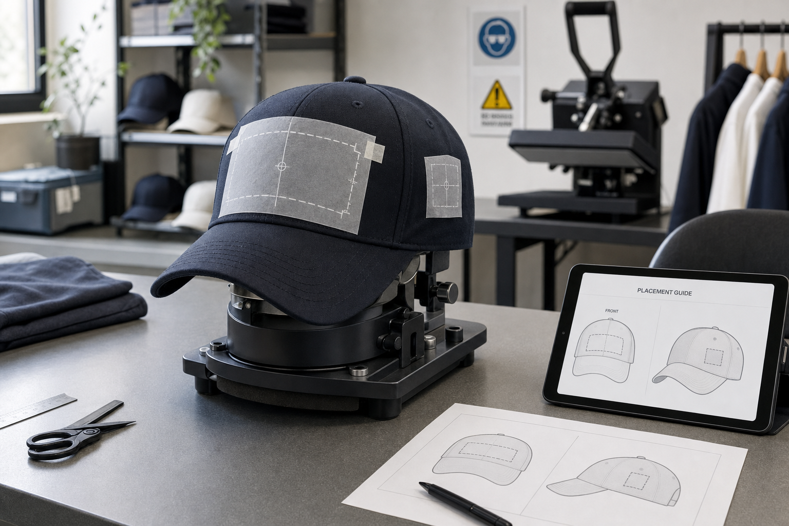
The mockup lets you compare positions before the cap goes into production.
Keep the design simple enough for the cap
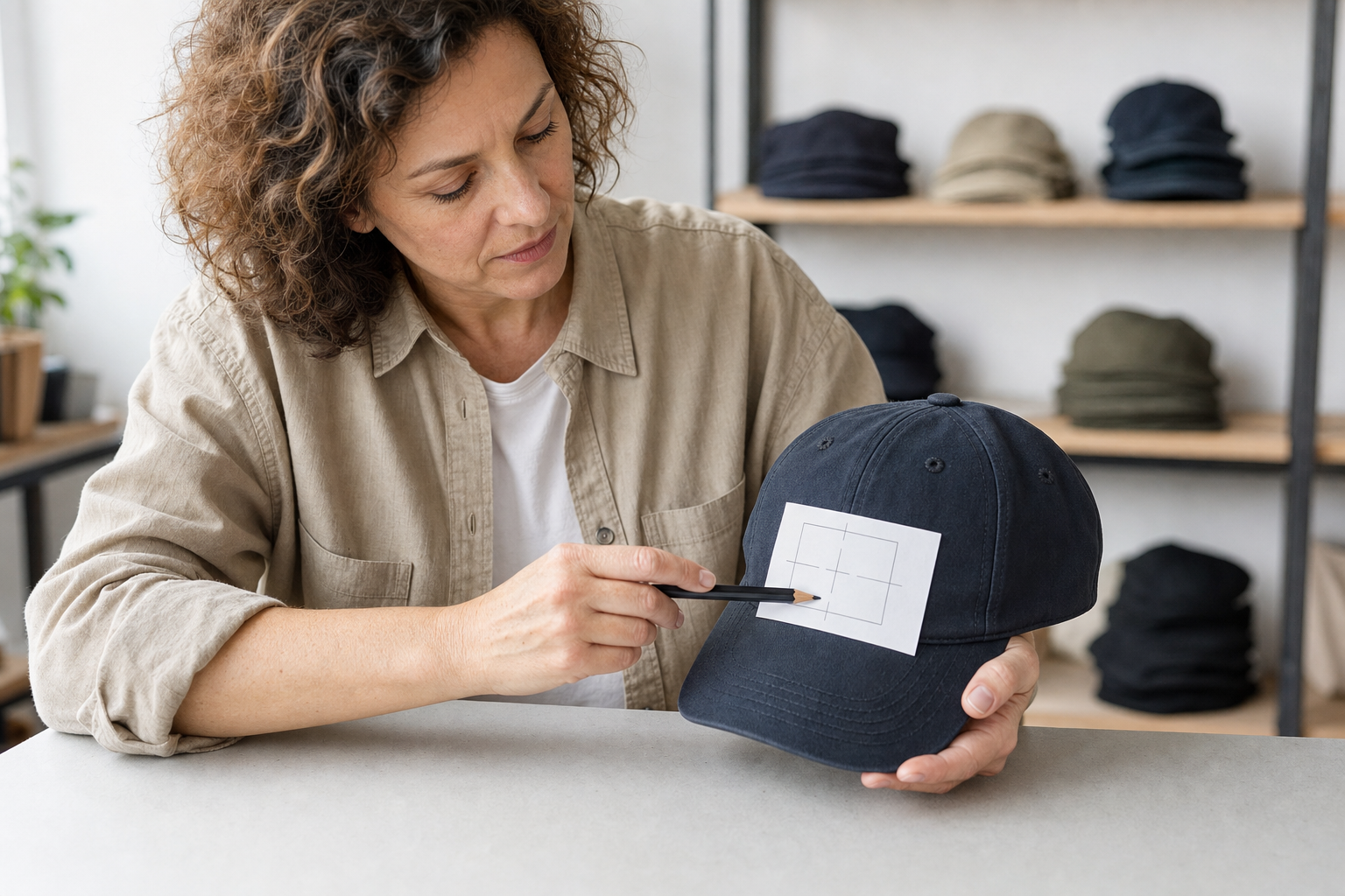
Caps give you far less flat space than a T-shirt or hoodie, so the artwork needs to be simpler and more controlled from the start. A clear logo, compact wording or a small graphic often works better than a busy design, especially across the curved front panels. At ColourPress NI, we help you judge how cap colour, contrast and placement affect visibility, whether the order is for uniforms, a team, an event or personal use. That early planning helps the design stay readable rather than fighting the shape of the cap.
Choose the position that suits the design
The front is usually the strongest position, but some designs can also work on suitable side areas if the layout stays clean. Through ColourPress NI, you can send artwork, choose the cap and test the proposed position in a mockup before production begins. That is the useful stage for spotting letters that feel too tight, logos that need simplifying or colours that do not stand out enough. Because the print area is smaller, these details matter quickly, and getting them right on the preview can save a disappointing finished result.
Frequently asked questions
What artwork works best on personalised caps?
Clear logos, compact wording and simple graphics usually work best. Because the surface is curved and the print area is smaller, designs with too much detail can lose impact once they are applied to the cap.
Can printing go on the side as well as the front?
Yes, if the cap and the design suit it. The front often gives the strongest visibility, but some layouts can also work on suitable side areas when the artwork stays compact and clear.
Why is a mockup useful for cap printing?
It helps you judge scale, contrast and position against the curved panels before production starts. That is often the stage where small changes make the difference between readable branding and a crowded layout.